OPINION: Democrats Discuss — The problem with electoral maps
Grant Perry is a sophomore studying environmental geography and political science. He is a member of the Ohio University College Democrats. The following article reflects the opinions and views of the author and does not represent the thoughts of the Ohio University College Democrats.
This is a submitted column. Please note that these views and opinions do not reflect those of The New Political.
Every election cycle, Americans from across the country are exposed to electoral maps. These maps depict the election results as blue and red states: a winner and a loser. But these maps do not tell the full story and do not accurately depict electoral significance.
The two main concerns with the electoral map are a misrepresentation of electoral votes by geographic accuracy and a lack of acknowledgment of battleground states.
Take figure one for example. This is the electoral map from the 2008 presidential election. When looking at this map, you can see that former Sen. Barack Obama won New Jersey and Sen. John McCain took home Alaska.
When comparing these two states on the map, Alaska is given a larger area than New Jersey, giving it more visual significance. In reality, New Jersey is much more influential in the outcome of the presidential election due to its higher population and density. At the time of the election, New Jersey had 15 electoral college votes — now 14 — compared to three votes allocated to Alaska.
Figure 1: 2008 presidential election electoral map. Graph from Vox.
How do we address this? One possible answer is to display election results on a cartographic map. A cartographic map is a map that focuses on a thematic pattern, rather than geographic accuracy. Figure two is an example of this type of map, specifically a proportional symbol map. This map depicts each state in the 2004 presidential electoral map at a size corresponding to its influence. Here it is easier to see the importance of a state like New Jersey as compared to Alaska.
Figure 2: 2004 proportional symbol cartographic electoral map. Created by Michael Gastner, Cosma Shalizi and Mark Newman from the University of Michigan.
Although a cartographic map is more accurate in electoral importance, it is not easy on the eyes. Cartographic maps also do not fix another major problem with electoral maps, which is a lack of representation of battleground states.
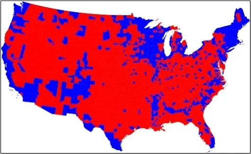
In figure one, Florida is represented as a blue state and does not show that President Obama won the state by only 3%. A solution to this could be to show electoral maps by county instead of by state.
When looking at figure three, you can see that the race in Florida was a lot closer than it appears in figure one. When looking at the election results by county, it appears that Florida should have been won by McCain, and Florida is not the only state that looks that way. In fact, without any knowledge of the electoral college, it appears that McCain was the winner in Nov. 2008 according to this map. This once again leads us back to the problem presented by electoral maps that put geographical accuracy over electoral value.
Figure 3: 2008 electoral map by county. Created by Mark Newman from the University of Michigan.
There is no single solution to the problem of mapping inaccuracies, and no map that can accurately depict the importance of each state's electors and the reality of battleground states. Mapmaking is an imperfect science, and there is always give and take, but when the map visualizes the results of who will be the next leader of the United States, we must continue to expect excellence.


